Developer Support
Accessibility Guidelines
12 min read
·
Last updated on Jul 24, 2023
It's important to take accessibility into account when building your app. This helps to make sure that all users, regardless of their ability, can access and enjoy your app.
Why accessibility is so important
It's better for people
Accessibility helps people of all age and ability have equal access, and aren't impeded from using our interfaces and products. Accessibility features help at least 1 out of 6 users, and the numbers continue to grow.
It creates better UX
Best practices in accessibility create a better experience for everyone. When you design for those with different capabilities, you create an experience that will best serve all audiences. For example, some practices are meant to reduce cognitive load or eye strain – this benefits all of our users.
It's better for business
Accessibility definitions are easy to implement in advance, and very hard to implement after the product is already developed. Skipping over accessibility best practices in the design phase will cause much greater and more complex development work later on.
It's a legal requirement
Digital interfaces are required by law to follow the WCAG - Web Content Accessibility Guidelines. Furthermore, there are regional guidelines and rules that vary from place to place.
Accessibility checklist
We recommend checking your app using the checklist below to make sure your users have a smooth, easy experience. It might seem like a lot to consider, but the results will be worthwhile.
Page titles
- Every page needs a unique page title.
- The page title (<title> tag) should be as close to the page’s H1 as possible.
- If there’s a flow that doesn’t allow a different page title per step, the page title for the flow should describe the overall flow.
- Success messages that open on a different page should have an explanatory page title.
Page structure (headings and hierarchy)
- Pages need to be structured with the correct headings.
- A full page should have a H1 as the main header, all other headers should be H2 or H3 (in hierarchical order).
- There should be only one H1 per page.
- Headings must accurately describe the sections of text they represent (they should be labels not statements).
Link text
- Link text should make sense on its own, with no need for additional context.
- Avoid generic link text like “Learn more”. Links should be understandable out of context, for example “Learn more about accessibility”.
- If generic text can’t be avoided, use an aria-label to add more information.
- The text in the aria-label should start with the link text, for example “Learn more” is the link text, and the aria-label is “Learn more about accessibility”.
- Link text should clearly explain what happens when clicked, like “Submit Form” instead of just “Submit”.
- Links that lead to the same location should have the same link text.
- Functional images/icons with links, should have alt text that explains where they lead. They should also be underlined and colored.
- If the image has text in it, the text should be part of the alt text, preferable at the beginning of the alt text.
Color
- Don't use only color to provide information. There should be another indicator, like icons (with an accessible name) or text.
- Be wary of color contrast.
- Don't use a font color that is too light.
- Linked text that is the same color as regular text should be underlined.
- If color is essential, consider using an aria-label to add more information.
Notifications
- Notifications shouldn't just disappear – they must be closed by a user action, for example: X or CTA (or both) .
- Don’t rely on color or symbols for meaning.
Labelling
All interactive elements must have visible or invisible accessible names so screen readers understand the context. These labels will be in the form of alt text or aria-labels.
Best practice for alt text
Best practice for aria-labels
Best practice for images
Icons and interactive elements that don’t have text
Icons and other elements should have aria-labels that explain the functionality.
Example
< and > arrows. aria-labels should say “Next page”/”Previous page” (if that’s the functionality), not “right arrow”/“left arrow”.
Interactive elements that have text
This applies to elements like buttons and linked images with text in them.
- The aria-label/alt text must contain the text that is in the element, preferably at the beginning of the aria-label/alt text.
Example
The section “Computers” has a button with the CTA “Read More”. The CTA is generic and needs an aria-label to explain what it is.
- What you should do: Add an aria-label with the text “Read more about computers” (or relevant additional information)
- What you shouldn’t do: Add an aria-label that says “How to turn off a computer”, or any other text that doesn’t have the words “Read more” in it.
Tooltips
- Tooltip should be a custom tooltip, not native CSS/HTML (screen readers and keyboards can’t access it).
- Tooltips should be operable by keyboard and read to screen reader users.
- Don’t put important information in tooltips.
Readability
- Use clear language simple sentences.
- Avoid words like “easy” or “simple”.
- Heading structure.
- Avoid abbreviations and acronyms, unless well known.
- Avoid excessive capitalization and all caps.
- Avoid s p a c e s.
- Use hyphens sparingly.
- Avoid ampersands (&) and other special characters - some screen readers can’t read them.
This guide is really good reference for readability.
Keyboard operability
Some people can't use a mouse and navigate by using tools such as a keyboard, mouth wand, or eye-tracking system. People should be able to navigate inside the component with a keyboard or screen reader. Make sure anything that can be seen by hovering with a mouse is also accessible to keyboard focus and screen readers.
When defining a component, check if a keyboard can be used to:
When defining a component, check if a keyboard can be used to:
- Navigate.
- Perform the same tasks as with the mouse (Tab ↑ ↓ Space ).
- Tell where the keyboard focus is.
Key functions explanations
- Shift + Tab – move to the previous interactive element; link, form element, button.
- Tab – move to the next interactive element; link, form element, button.
- Enter ↤ – activate the current (focused) interactive element.
- `Space` – check or uncheck a checkbox form element. Will also activate a button that currently has focus.
- ↑ ↓ arrow keys – move between radio buttons or, in some cases, menu links.
- ← → arrow keys – in some cases, move between menu links or adjust sliders in audio and video plugins.
- Esc. – Close the current modal dialog or dropdown menu and return focus to the element that spawned it.
What is a screen reader
Screen readers help people with visual impairments by reading both visible and non-visible alternative text aloud.
Website components
On-stage text size
- Running text: from 16px
- Meta data: from 14px
- CTA: from 16px
Touch hit area
Make sure that all actionable controls have a touch hit area of at least 44 x 44px. Additionally, make sure there is at least one pixel between targets.
Tab order
Tab navigates only between interactive elements (button, menu, link, inputs etc.) and must be navigable in a meaningful sequence as the user presses the tab key.
Ideally the tab order should follow the reading order.
(LTR) Default is Top Left to Right, Top to Bottom. When there are no more interactive components on a line, the tab continues down to the next interactive element.
Example: Date Picker Input

"X" is a top element but the last one in the actions flow.
Keyboard operability
- Navigate to the input by clicking on Tab (1) Clicking Enter ↤ opens the date picker calendar.
- Navigate with Tab key for the next action inside the calendar (2).
- Navigate between months with Tab and Enter ↤.
- Navigate with Tab to the selected date (4) In case you are on a month with no selected date Tab will navigate to the first day of the month (4).
- Navigate using the ↑ ↓ ← → between the dates.
- Select a new date with Enter or space ↤.
Focus
- Focus management: Define where the keyboard focus will go for each change of context (new screen, new state, modal or panel closure, etc...). Otherwise, focus will automatically move to the top of the page.
- Focus indication: When QAing, make sure the focus ring (must have sufficient contract to background) is visible/exist on all interactive elements.
Behavior
Semantics
Make sure it's perfectly clear from your specs what is the component and what it does.
Element types
- Boxes, Shapes, and Strips
- Buttons and Upload Buttons
- Checkboxes and Radio Buttons
- Contact Form
- Date Picker
- Dropdown Menus and Expandable lists
- eCommerce Cart Widget and Quantity Selector
- Images, Galleries, and Slideshows
- Menus, Breadcrumbs, and Page Navigation (anchors)
- Popups/Lightboxes
- Sliders
- Social Icons
- Tabs and Tables
- Text, Text Input, and Text Boxes
- Tooltips and Hover States
- Video and Audio Players, External Video
Scaling
Make sure components are interface resizing / re-spacing compatible meaning they don't lose functionality like text getting cropped or a move when magnifying the interface.
Guidelines
Container behaviour: Width = fixed, Height = resize
Text size: can resize at least up to 200%
Text line height: 1.5em
Letter spacing: 0.012em
Word spacing: 0.016em
Spacing between paragraphs: line height X2
Interface zoom: can resize at least up to 400%
Consistency
Be consistent across design, placement, and labelling. Components with the same functionality should work and be identified consistently.
Dashboard component
Setting the correct hierarchy
The order of the sections should be determined by the order we'd like the users to consume it.
Here are a few different approaches:
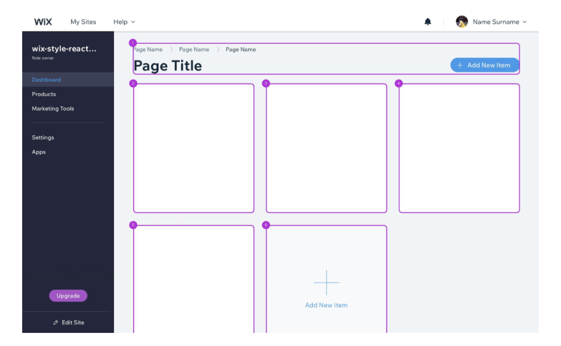
1. Emphasizing the content of the main column: the user will encounter all the sections of the main column from top to bottom, and only then the sections of the side column, from top to bottom.
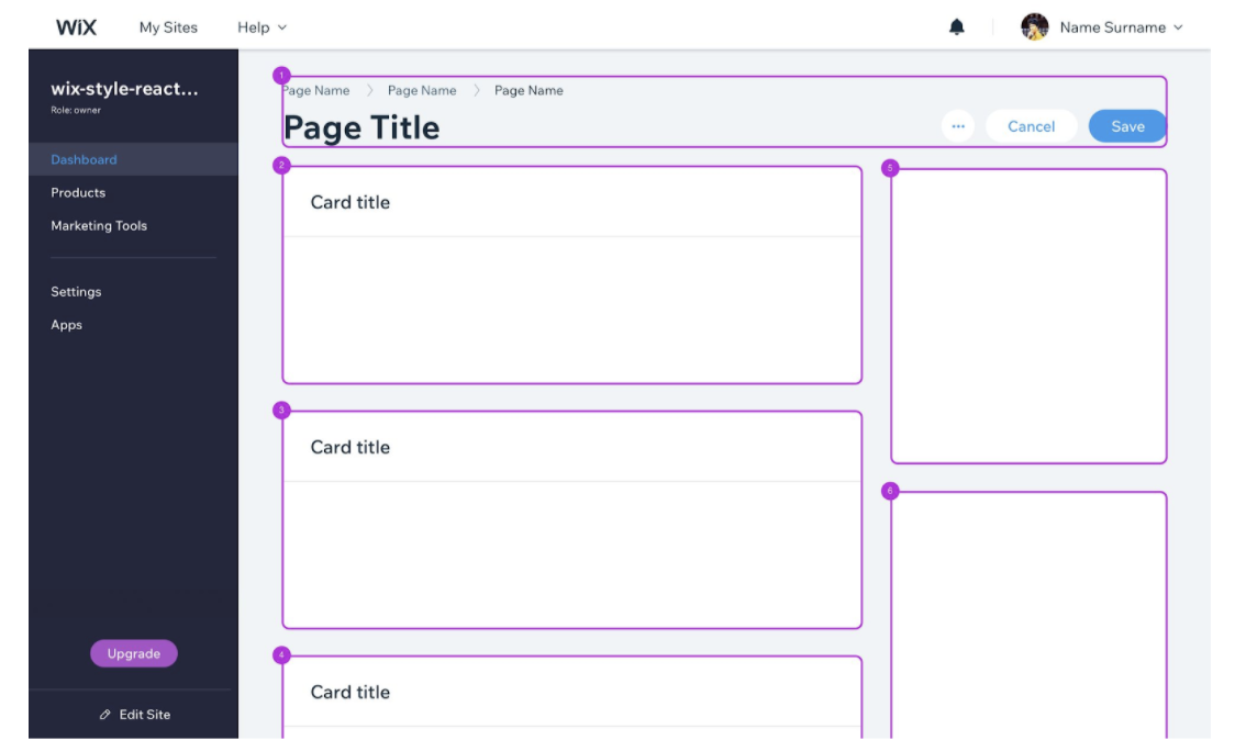
2. Creating gradual exposure according to what is exposed in the viewport: the user will encounter the sections in the order they are revealed in the viewport, first those exposed in the main column and then the ones on the side.
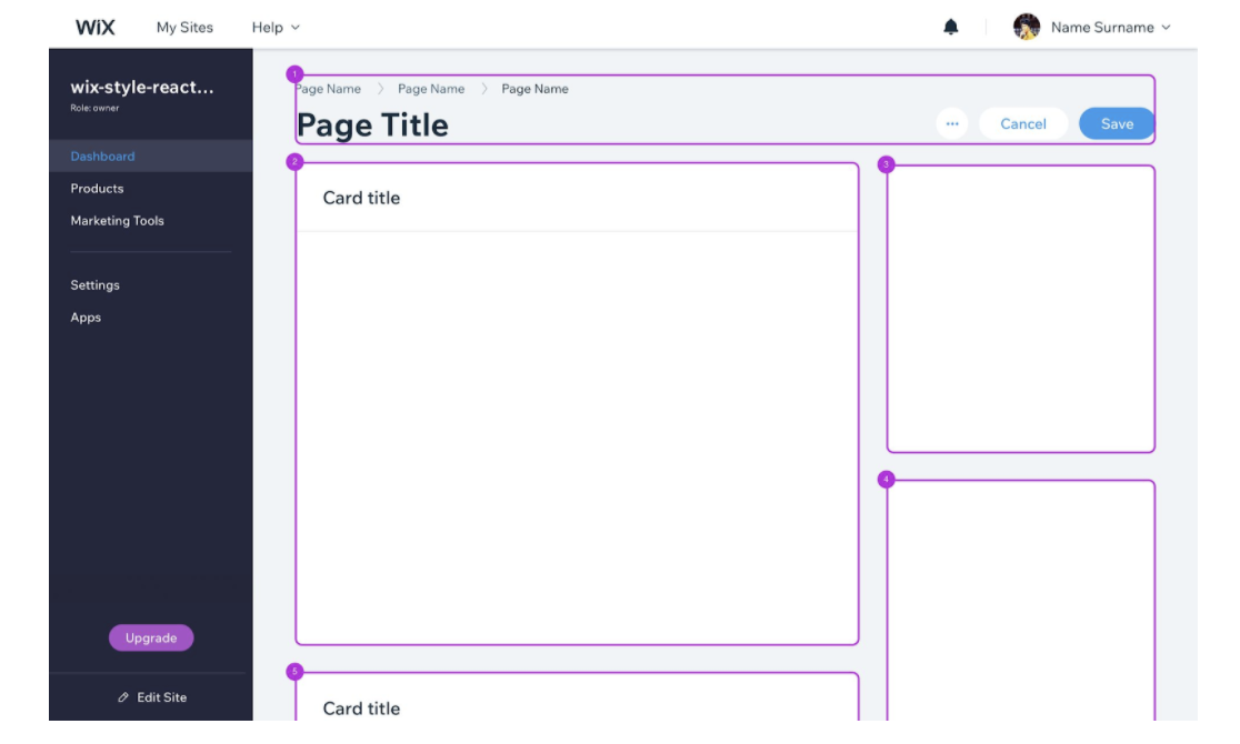
3. Exposing sections from left to right (default order): the user will encounter the sections in the default order they are revealed in the viewport; left to right, top to bottom.
Headings order
Heading levels tend to differentiate from one another visually, to create clear visual hierarchy. Eventually, the tag is defined technically by the developer, but is granted by default if you use it as defined in the design system.
The headings should be in a descending order, and each heading's definition should be relevant to its type.
Organize the sections in the page in a way that will make sense. Take a moment to consider which heading type should be added – is it a subsection or a section? Are they in the correct order?
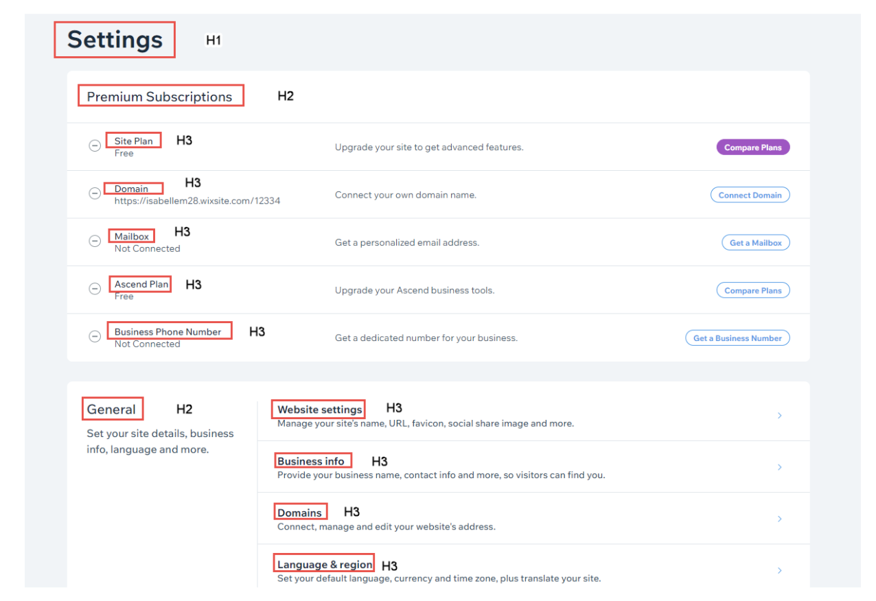
- There should only be one H1 per page - the page title itself.
- Ensure that each heading title (from H2 to H6) is arranged properly in the hierarchical descending order. Define each and every heading on the page, and make sure you haven't skipped any.
- The heading itself should describe the section accurately, and not mislead our users.
- Set headings order properly
- Use only one H1 as the page main title.
- Use H2 for sections titles.
- Use H3 for subsections titles, etc.
- Make sure H2 to H6 headings are ordered in descending order, no skipping.
- If the text style you decided to use isn't tagged correctly by default on WSR (as presented in the image below), make sure to ask the developer to edit the heading tag specifically for this heading.
Accessible app example
Here's how one of our third-party developers got started with making his app accessible (Comments app).
- Screen reader users can’t log out because this button isn’t interactive.
- Screen reader users don’t understand that each comment has a rating.
- Screen reader users can’t share comments because the share buttons aren’t interactive.
Check it out (listen with your sound on):
Let’s focus on the issue with the logout button. Take a look at the code to spot the problem:
1<a onClick="logout()">Log out</a>
The developer fixed these issues by defining the appropriate ARIA roles and keyboard behavior. Now, screen reader users can logout, add a rating, and share the comment to social media.
Check it out (listen with your sound on):
Check it out (listen with your sound on):
Here’s the new code for the logout button:
1<a onClick="logout()" role="button" tabindex="0">Log out</a>
Tip:
Want to see more code examples from this app? Uri, an app developer, wrote a blog post about how he made his app accessible. Check it out.
Note:
We’re working on adding more examples and case studies to show you how our developers made their apps accessible. Want to share your story? Reach out to us.
Testing for accessibility
As part of testing your app, you’ll need to make sure that each component is accessible on the user’s live site. Download and follow the relevant testing plan(s) for your app. Each testing plan includes specific tasks for testing accessibility.
Tip:
Before you dive into our testing guide, we suggest checking your app with a tool like Axe Chrome extension (to get an accessibility report) and ChromeLens (to see what your app looks like to someone who is visually impaired).
Was this article helpful?
