Developer Support
Build an App Settings Panel for Website iFrame Components
14 min read
·
Last updated on Jul 24, 2023
Every website component needs an App Settings panel that allows Wix users to customize the app and its content. The capabilities you offer in this panel – and the user experience – can determine whether users will choose your app.
Follow this guide to create the best user experience for your App Settings panel. The goal is to make it easy for users to set up and customize your website component.
Follow this guide to create the best user experience for your App Settings panel. The goal is to make it easy for users to set up and customize your website component.

Have a multicomponent app? Create a separate settings panel for each website component. For example, the Wix Forum app has two website components: a page for the forum itself, and a login widget. Each component has its own settings panel.
Note:
The App Settings panel is for Wix users only – not site visitors.
Before you start
Do some prep work before you start designing (it’ll save time in the long run):
- Make a list of settings and features in your app: Have this list handy, so that you’ll be able to quickly organize your settings into tabs.
Panel structure
Use our starter template as a starting point to create your panel, and customize it according to your app’s specific settings and features (that’s where the list you made comes in handy).
Here’s a quick look at how to structure your panel menu. Decide which tabs (Main, Settings, Text, Layout, Design, Animations, and Support) and action links (Add-Ons and Upgrade) are relevant for your app.
Here’s a quick look at how to structure your panel menu. Decide which tabs (Main, Settings, Text, Layout, Design, Animations, and Support) and action links (Add-Ons and Upgrade) are relevant for your app.

In the next few sections, we’ll walk you through each of these tabs and action links. Here are a few general guidelines:
- The Main tab is a must: Put it first, and always open your panel to this tab.
- Keep the divider in place: In our starter template, there’s a divider between all the setup tabs and the Support tab – don’t remove it. It keeps the panel organized between tabs that help users set up their app, and other tabs and action links.
- Stick to these tabs, in the order that we outlined above: This will create a better user experience, because users are already familiar with our standard structure.
- If you need to add a custom tab, keep the name short – we recommend up to 150 px (around 15 characters).
- In some cases, it makes sense for the panel to have a different order. For example, if the options in your Settings tab depend on the layout the user chose, then the Layout tab should come before the Settings tab (like the FAQ app). If you think your menu should have a different order – talk to us.
Assets
Here’s a quick reference of the PSDs and design files we have for the App Settings panel. Go ahead and download the files relevant to your app.
Note that we also have a collection of UI controls used in the settings panel.
Note that we also have a collection of UI controls used in the settings panel.
- Add-ons: Have any add-on components in your app? Use these visual aids to help you design a modal with your app’s add-ons.
- Connecting an account: Follow the flow in this PSD.
- Checkbox with Text Input
- Date picker
- Draggable list
- Drill-down to organize settings: If one of your tabs is cluttered with too many settings, consider creating categories and allow users to drill down to customize the settings. Follow these design files.
- Free trial: Have a free trial? Follow this PSD.
- Premium features: Use this PSD as a guide for adding the premium icon.
- Text input (double)
- Thumbnails: When showing users different options (e.g., for layouts or animations), use the guidelines in this PSD.
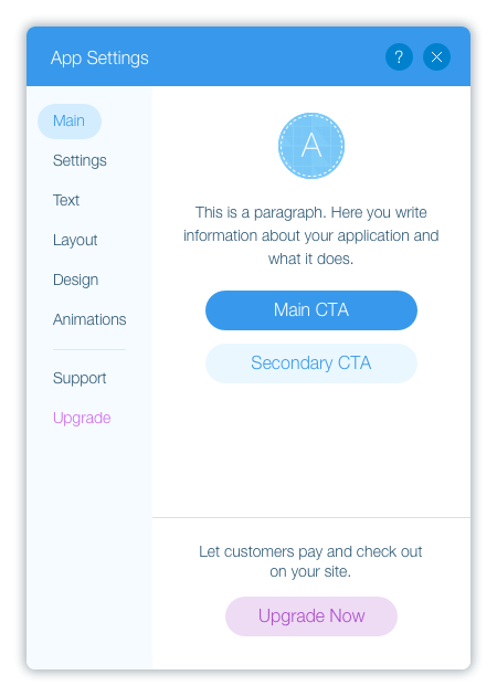
Main tab
This is where you’ll help users start setting up your app. Decide what your app’s main action is – and make this the “Call to Action” (CTA) in this tab.
Usually, this would be the first action users will need to take in setting up your app. Go through the examples and style guides below to get an idea of common CTAs.
Usually, this would be the first action users will need to take in setting up your app. Go through the examples and style guides below to get an idea of common CTAs.

Important:
The Main tab must be the first tab in your panel. Also, always open your panel to this tab.
How to design this tab:
- Let users know what your app does. Place your app icon and a short description (3 lines max) at the top.
- Show users what their first steps should be. Add 1 or 2 CTA buttons that send users to your app’s main actions – see our examples and style guides below to figure out what your app’s CTA should be.
- Add a button that sends users to your app’s main action (Note for Developers: Use btn-confirm-primary class).
- (Optional) Add a second button that sends users to another important action in your app. The length of this button should be the same as the button above (Note for Developers: Use btn-confirm-secondary class).
- If your app has a premium version, add an upgrade banner. At the bottom of the Main tab, add a button and a short sentence explaining why users should upgrade. Use the Wix.Settings.openBillingPage to open the billing page directly. If you only have one paid plan, make sure to hide the button once the user upgrades).
- If users must do the main action, make that clear. When users skip the main action and go to the next tab, display this red notification to let them know that they missed an important step. When users hover over the notification, display a tooltip with a short explanation. The notification (with its tooltip) is already built-in to the panel tabs UI control (Note for Developers: Use the showTabNotification function).


Note:
Offering a free trial for your app? Once the trial expires, display a notification/ message in the Main tab, to let the user know that the trial expired.
Examples and Style Guides
Here are some general examples of popular main CTAs:
- Upload or enter data. If the user’s main task is to manage data, like text for a blog or images for a gallery, your CTA button should open a modal so that users can easily upload and enter content.

- Manage or set up the app in the dashboard. Your CTA button should open your dashboard so that users can set up your app and learn more about how to manage your app later. For example, users might need to add products in an eCommerce app or create a menu in a restaurant app.

- Log in/sign up for your service or a third-party account like Facebook. Before you make this your CTA, talk to your account manager. If your account manager approves the use of accounts in your app, your CTA button should open a modal that guides users in signing up/logging into their account. Download & follow this style guide.
If users don’t need to connect an account, and you don’t have a dashboard component, then your app’s main action should be one of your app’s settings.

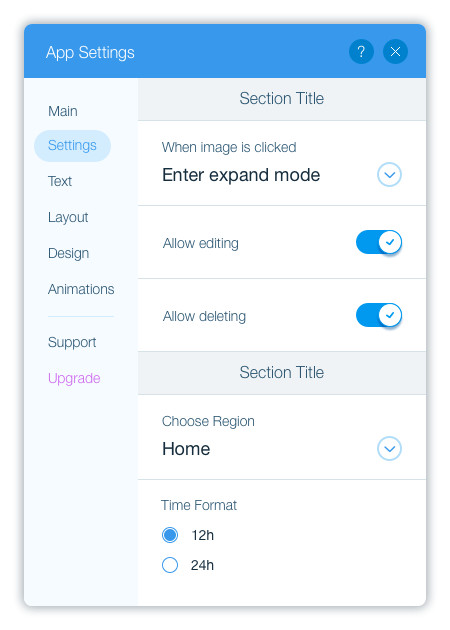
Settings tab
This is where you’ll guide users in setting up the app and defining general functionality, for example:
- Enabling/disabling features
- Defining regional settings (app’s language on the live site, measurement units, currency, etc.)
- Uploading images and other media files
- Defining privacy/sharing settings
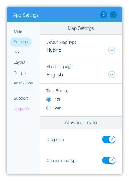
How to design this tab:
Map out your app’s general settings, and find the right UI control for it. Here are some common examples:
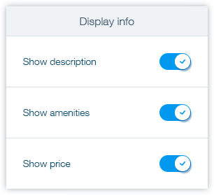
- A list of functionalities that users can enable/disable, or a list of elements that users can choose whether to show/hide on the live site – use the toggle switch for each one.
- Text settings: use text input fields (If your app has many short text fields to customize, create a dedicated Text tab).
- Image uploads: use the image preview UI control to allow users to replace your app’s demo image. When users click on the button, open the Wix Media Manager so that users can choose an image they already uploaded to Wix servers (Note for Developers: Since users are replacing an image, make two minor changes to the image preview UI control – the button text should be Replace Image, and the icon should be image-change).
- Audio/document uploads: add a button. When users click on this button, open the Wix Media Manager so that users can choose a file they already uploaded to Wix servers.
- Account settings: to allow users to activate an account with public data, use the text input field with validation.
Text tab
Usually, text fields should be part of your Settings tab. However, if your app has many short text fields (like titles) that users need to edit, add a dedicated Text tab.
Note:
Do users need to add a lot of text in your app, like a blog? Instead of having a Text tab, open a modal from one of the other tabs and let users customize the text in a bigger window.
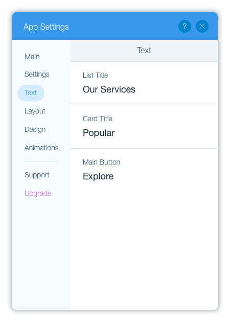
How to design this tab:
- Add a field for each text setting
- Add default text: This text will be displayed in your app on the live site, until the user changes it.

Layout tab
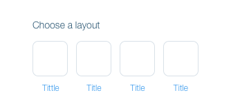
This is where you’ll show users the different layouts available for your app. Make the layouts different enough from each other so that users can easily choose the best one for them.

How to design this tab:
- Show users a set of thumbnails with all the layout options: Each thumbnail should have the name of the layout and a visual representation of how the content is arranged.
- Use the blank thumbnails in this PSD as a starting point.
- Have many different layouts? Make the thumbnails smaller so that you can fit more thumbnails in a row. (We have a few different size options in the PSD.)
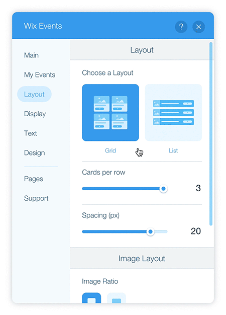
- When a user chooses a layout thumbnail, show advanced options for this layout: Each layout can have different options, like the alignment, number of columns and rows, spacing between elements, and more. For example:
Design tab
This is where users will customize the color, font, and styles for different elements in your app.
Important:
Have a premium version of your app? Keep in mind that all users must be able to change your app’s colors and fonts – so include these options in your app’s free version.
How to design this tab:
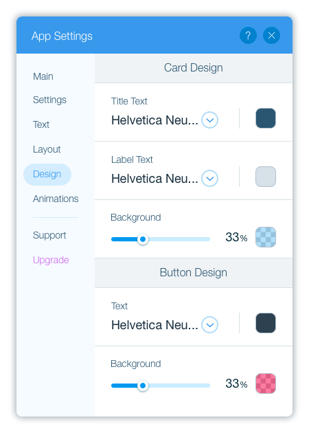
- Let users change your app’s colors: Add a color picker for each element that users can customize. We have two color pickers:
- Color picker with opacity: allows users to change the color and adjust the opacity.
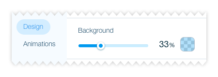
- Color picker: allows users to change the color only.

- Color picker with opacity: allows users to change the color and adjust the opacity.
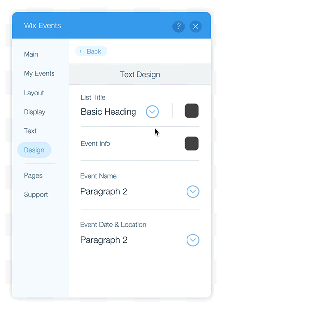
- Let users change the font and color of text elements:
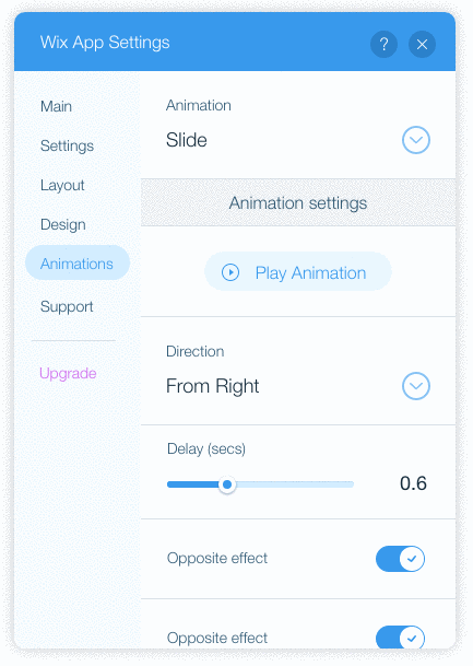
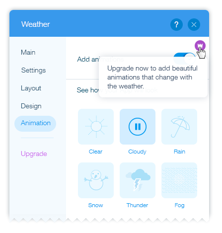
Animations tab
This is where users can choose your app’s animation style. The Animations tab isn’t part of our starter template – add it if your widget is an animation, or your app has animation effects.

How to design this tab:
Show users all the animation options. There are two ways to do this:
- Thumbnails (recommended): Use our blank thumbnails (available in this PSD).
- In each thumbnail, display the name of the animation and its icon.
- When users hover over the thumbnail, show a preview of the widget with this animation.
- Dropdown list: If you don’t have icons for your animations, show the options in a dropdown list. When users choose an animation, show a preview of the widget with this animation.
Support tab
This is where you’ll tell users how they can reach out to you.
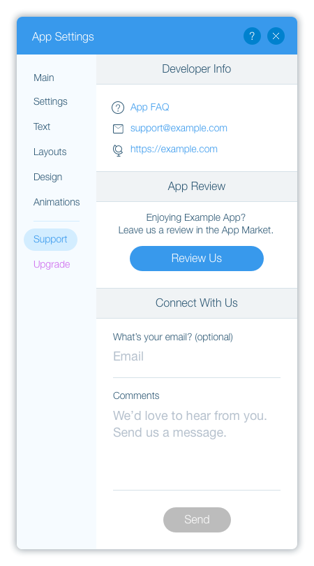
Note:
Keep the Support tab right below the divider (as it is in our starter template).
How to design this tab:
Take these sections that are already in our starter template, and add your information:
- Developer Info – Information about how users can contact you, like a support email, phone number, etc.
- App Review – A link to your app’s reviews tab so that users can easily leave feedback.
(Note for Developers: Use the Wix.Settings.openReviewInfo SDK method.) - Connect With Us – Allow users to send you a message directly from this tab.
Your app's Add Ons
Have a multicomponent app? Add an Add Ons action link in your panel menu. This makes it easy for users to add your app’s website components – they’ll be able to add widgets that weren’t added when the user installed your app, or add your page component again (if you enabled this option in the Wix Developers' Center). When users click on the link, open a modal.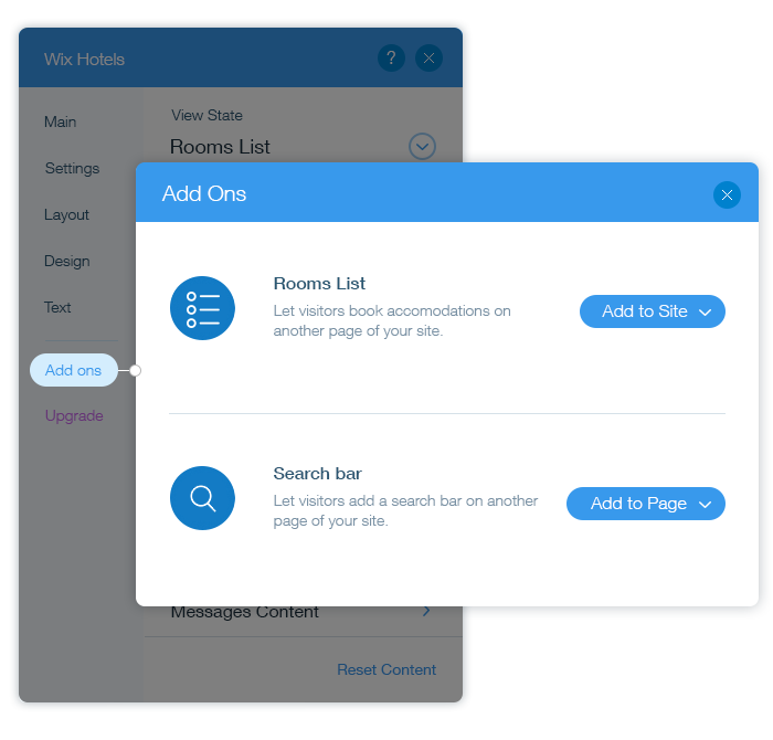
How to design the modal:
Download our visual aids to help you design – this zip file includes a style guide, PSD, and more.
- Explain each add-on component: For each one, add an image/icon, a name, and a short description.
- Is your add-on a page, fixed-position widget, or a widget that appears on all pages? Have an Add to Site button (Note for Developers: Use class btn-confirm-primary). When users click it, add the component to the site (Note for Developers: use the Wix.Settings.addComponent method in the SDK).
- Is your add-on a regular widget? Have an Add to Page dropdown list. Open the list of pages in the user’s site so that users can choose where to add the widget. (Note for Developers: Use the Wix.Settings.getSiteMap SDK method), then add the widget to this page (Note for Developers: use Wix.Settings.addComponent).
Your app's upgrade link
Make it easy for users to upgrade your app.
- Add an upgrade link in your panel menu: It should the last item in your panel.
- Link to your billing page: When users click Upgrade, send them directly to your billing page (Note for Developers: Use the Wix.Settings.openBillingPage SDK method).
Organize each tab
Organize each tab so that your setup flow is easy for users to follow.
- Display the most important settings first: This way, users won’t miss important setup tasks.
- Group related settings together: This makes it easier for users to set up your app. For example:
Does each section have more than 4-5 settings? Create categories and allow users to drill down to customize the settings. Download and follow these design files to help you get started. For example:

- Gradually expose advanced settings: First, use a toggle to allow users to enable/disable features. Then, show advanced options if a user enables this feature. For example:
- Plan how settings impact what’s shown in other tabs: If the user chooses something in one tab, you may need to show/hide options in other tabs. For example, let’s say users can choose whether to display a title in your app. In this case, if the user decides to show the title, your Design tab would show design settings for the title.

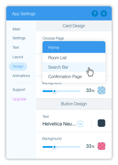
- Have a page app? If you have a different settings for each page in your app, add a dropdown list at the top so that the user can first select the page.
General tips in settings building
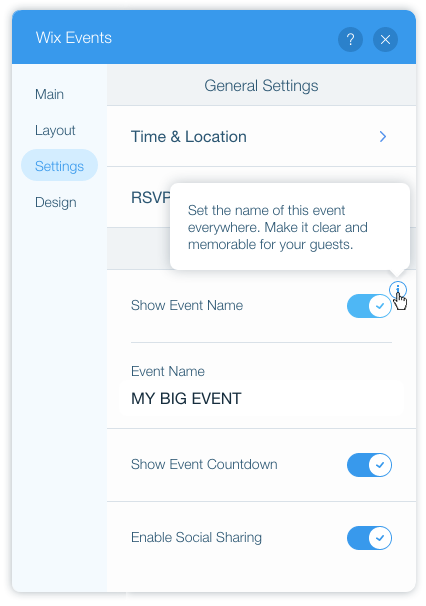
Help users understand complicated settings with tooltips: This avoids cluttering the tab with long explanations. Be concise and helpful:
- Tell users what they need to know, and keep it short (3 lines max).
- Don’t repeat what you’ve already said in the panel.
- Mark premium features: Add a premium icon next to these features. When users hover over the icon, display a tooltip with more information about the feature. Download this PSD as a guide to help you add the premium icon.
- When a setting has a few options that users need to choose from – which UI control should you use?
- Features that users can enable/disable, or elements that users can show/hide: Use toggles when you have up to 3 features/elements, and use checkboxes if you have a list of 3-4+ features/elements.
- You’re giving users a few options but they can only choose one: Use radio buttons for up to 3 options, and use a dropdown list if you have more than 3 options.
Sensitive data
Does your app have sensitive data, like payment info? Show it to site owners only, and hide it from contributors. On the server-side, identify the user. If a contributor is logged in, hide the setting and follow one of the example images below.
- When only one setting in the App Settings panel should be hidden: Hide the setting and add a short description to let contributors know what this setting does and that it’s for site owners only.

- When the entire tab in the App Settings panel should be hidden: Hide all settings in this tab and add a short description to let contributors know what this tab is for and that it’s for site owners only.

Was this article helpful?
