Create a Custom Element and App Settings Panel
Availability
This feature is in beta testing and isn't available to all users. We recommend Wix Blocks to build custom elements. Learn more about custom elements with Blocks.
A custom element lets users drag and drop a visual extension to exactly where they want them on their site. Once a user has added it to the Wix Editor, the extension will be moveable and resizable, giving users full visual control over the extension.
Custom elements need an app settings panel that lets Wix site owners customize the app and its content.
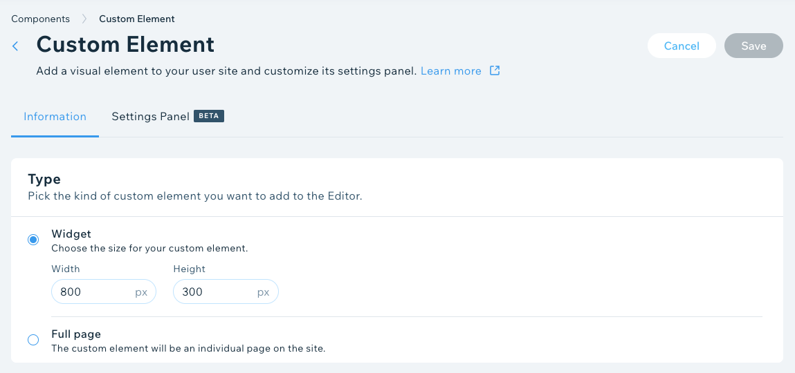
1. Set up a custom element
Here's how to build your custom element:
- Log in to the Wix Developers Center and click Create New App.
- Go to Extensions in the side menu under Build Your App.
- Click Create Extension.
- Find Custom Element.
- Click Create.
- Under Type, select from Widget or Full page. If you choose Widget, make sure you set its size.
7. Under Basic Info, complete the following:
- Name – the name that you want your extension to be saved as.
- Tag Name – a unique name for your extension that'll refer to your element in the code (use dashes instead of spaces for this).
- Script URL – a URL where the JavaScript code of your extension is located.
8. If you have multiple widgets or pages with widgets, then you'll need to add the descriptions and an image for each under Widget properties.
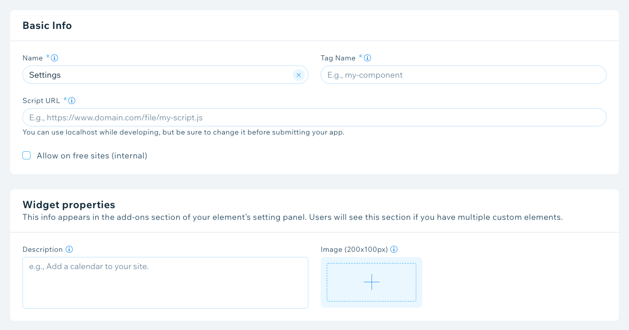
9. Click Save.
Script code example
Here's what the script looks like. Take note of the wixconfig and wixsettings attributes. Once you've loaded the code it'll trigger the connectedCallback function.
1class MyComponent extends HTMLElement {2  constructor() {3    super();4  }5  // Will be called with new wixsettings data for each change to the component data in the editor.6  // Will be called once on live/preview mode (on page load)7  connectedCallback() {8      const wixconfig = JSON.parse(this?.attributes?.wixconfig?.value ?? '{}');9      const wixsettings= JSON.parse(this?.attributes?.wixsettings?.value ?? '{}');10
11      // current instanceId12      const instanceId = wixconfig?.instanceId || '';13
14      this.setAttribute('style', 'display:block')15
16      this.innerHTML = `17        <div style="display: flex;18            align-items: center;19            justify-content: center;20            flex-direction: column;21            width: 100%;22            height: 100vh;23            background: #f0f8ff;24          ">25            <h1>This is a Web Component demo</h1>26        </div>27      `;28
29      /* Will work if a dropdown field is added to the settings panel in the Developers Center 30      with the 'dropDown' key and two options e.g., 'Dog' and 'Cat'.*/31    /*32      this.innerHTML = `33      <div style="display: flex;34          align-items: center;35          justify-content: center;36          flex-direction: column;37          width: 100%;38          height: 100vh;39          background: #F0F8FF;40        ">41 ${wixsettings.dropDown === "Dog"? "<h1>This is a Dog</h1>" : "<h1>This is a Cat</h1>"}42      </div>43    `44    */45  }46}47
48//my-tag should be the same as the tag name in the custom element's definition in the Developers' Center.49customElements.define('my-tag', MyComponent);
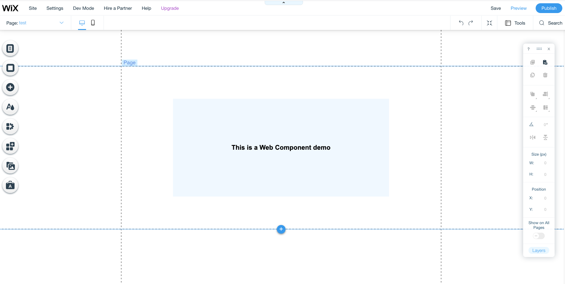
Final result
Here's what you'll see when the code's working correctly.
How the data flow works
Each extension has a unique key that you define when adding the element. Once a user makes a change, the connectedCallback function is triggered. This returns both a wixconfig and wixsettings attribute.
wixconfig attribute
The extension will get a wixconfig attribute with the following properties:
instanceId: a unique identifier of your app within a specific user's website, created whenever your app is installed on a site.
ViewMode: gets the mode the site is currently being viewed in:
Editor: when the site is in Editor modePreview: when viewing a site preview in the EditorSite: when viewing the published site
DeviceType: gets the current device type:
Mobile: when a user accesses the site with a mobile deviceDesktop: when a user accesses the site with a desktop device
Note:
If a user changes their viewMode, connectedCallback will be triggered.
wixsettings attribute
The extension will get a wixsettings attribute with the following property:
1{2 "wixconfig": {3 "instanceId": "a1179ba3-49b3-44f6-b491-0cb4d2dbe3c7",4 "viewMode": "Editor",5 },6 "wixsettings": {7 //key:value according to settings panel saved data8 }9}
- This extension data can be saved while editing the web component in the Editor. The parameters and default values are defined by the app owner and can then be updated by the site owner in the Editor.
Note:
The Custom Element will be wrapped in an iframe in the Editor and Preview for security reasons.
customParams
During installation you have the option to bypass customParams data and use the default settings data instead.
Example: {data:{title: “something”}}
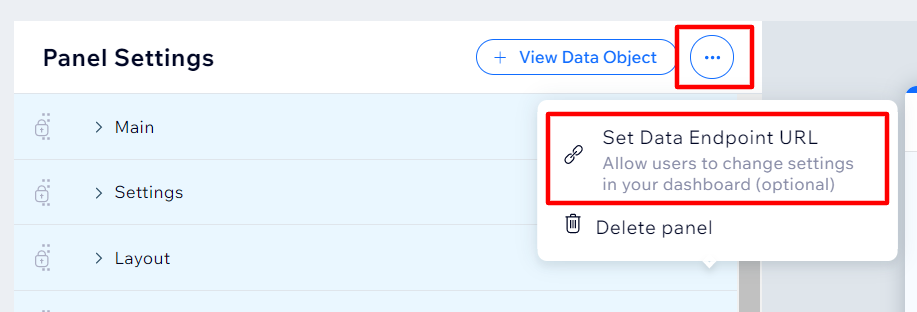
Create a data endpoint URL
You'll be prompted to set a data endpoint URL in the Wix Developers Center. This is where all changes made in the settings panel of a custom element will be sent, allowing you to sync things on your end.
We'll send data to this endpoint URL when:
- You've reached the limit of data that Wix provides for you.
- A user changes the theme or its font / color (this returns the instanceID and object type).
- A user publishes their site (this returns the instanceID and status
published). - There's any change to the app settings panel data.
Initial data and saving data
When a user first adds the extension the settings will be loaded with the default parameters you’ve set in the Developers Center. Each time a user initiates a change (e.g., changes a color), data is sent to the widget under the wixsettings attribute.
This means that the next time the user loads the settings panel, it'll show all the recent changes.
If there are changes on the app side (e.g., a user changes a configuration on the app dashboard) you can load the configuration stored on the app side by setting the data endpoint URL. This URL will be called every time the settings panel is loaded in order to load the default configuration.
The structure of the response should be exactly like the data object generated by the settings panel (which you can see when you click ‘View Example Data Object’). If something is broken on the data object, the settings panel will revert to load the settings saved on the Wix site.
2. Create the app settings panel
Here's how to build an effective app settings panel for your custom element:
Before you start
Do some prep work before you start designing (it’ll save time in the long run):
- Make a list of your app's settings and features: this will help to quickly organize your settings into tabs.
- Learn about all the extensions that can be used on the panel: this will help to make sure you've considered all types of settings.
- Differentiate between Editor and Dashboard actions: the app settings panel should be for Editor actions (like design elements), while the Dashboard should be for other configuration types.
Get started
1. Select the custom element you wish to create an app settings panel for.
4. Click the Settings Panel tab.
5. Use the Settings Panel builder to choose your settings tabs and components.
6. Click Save.
Choose your settings tabs
These tabs reflect the basic / core settings for your app. Some of these are a fixed requirement (and therefore locked), but you'll be able to edit some things within them. The rest are optional, and you should choose these based on what fits best with your app.
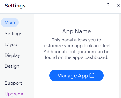
Main (required): this is always the first tab. It shows:
- The app/widget name.
- A short description (you can edit this).
- The main CTA button that leads to your app's dashboard (you can edit the label for this).
Settings:
In many cases, the custom element settings will be controlled from the app dashboard. However, if you want to guide users in setting up the app and define general functionality, this is the tab for it.
- Enabling/disabling features
- Defining regional settings (app’s language on the live site, measurement units, currency, etc.)
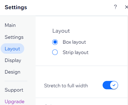
Layout:
This is where you’ll show users the different layouts available for your app and offer adjustments to things like spacing. Make the layouts different enough from each other so that users can easily choose the best one for them.
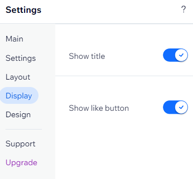
Display:
this gives users control over which elements are shown/hidden. For example, here you might have a toggle for 'Show Title'.
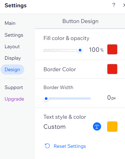
Design:
This is where users will customize the color, font and styles for different elements in your app.
Let users change your app’s colors: add a color picker for each element that users can customize. We have two color pickers:
- Color picker with opacity: allows users to change the color and adjust the opacity.
- Color picker: allows users to change the color only.
- Let users change the font and color of text elements
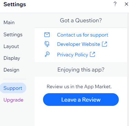
Support (required):
This displays the following and can't be edited:
- Contact for support: this is the email address you supplied in the Contact Info tab, and is where users can contact with you with questions about your app.
- Developer website: this is a link to your own website, taken from the Company Info section of the Developers Center.
- Privacy policy: this is also taken from the Company Info section of the Developers Center.
- Add a Review: this button takes users to your listing to leave a review.
Upgrade (conditional):
This leads the user through the app upgrade flow, with the exception of two scenarios (in these scenarios, the Upgrade tab won't display):
1. The user is already on the highest paid plan.
2. You only offer a free plan.
Add Ons (conditional):
This is added automatically if you have multiple, custom size custom elements. Additional pages will be added automatically to the user's site with the option to add further widgets via the settings tab.
You need to define the widget's name, description and image on the custom element's information tab.
Choose your components
Each component allows the user to configure and send relevant data to your widget. Each component has the following configuration:
- Label: set up the label/text next to the component. You should show an ellipsis or tooltip if the label is too long.
- Key: the key that holds the value and is sent to your widget under the
wixsettingsobject. The key should be unique per widget.
In addition, each component will hold configuration dedicated to the specific component and an optional tooltip for extra info:
Selectors
- Color picker: choose a color value for an element – this could be the color of a CTA button, background of text. Check out our guide to color wiring.
- Dropdown: select an item from a list of options. As these are hidden, it's useful for longer lists or when you want to encourage a user to select a specific option over others.
- Radio buttons: select an item from a list of options. These are visible immediately, and best for 2-5 options.
- Toggle: switch between two states – this could show or hide a title, or stretch your app between regular and full width.
- Slider: select a value within a range. This works well when choosing things like border radius or spacing between images.
Buttons
- Reset button: lets site owners return all properties in a tab to their last saved state. If it's the first time it's been opened and nothing has been changed by the user, it'll revert to the default values.
Text
- Text input: allow your user to change text in your app. For example the title of an image gallery.
- Text style and color: choose a color, size and font for any text displayed.
Settings Panel design
- Section: group similar items under a header.